2011-10-29

UCLA Series: Boelter Hall and Math Sciences

We now take a look at a couple of buildings on the UCLA campus.  This will most likely turn into a series of architectural posts, each of which will examine a different era of building at UCLA.  These installments will not be in any particular order.

If UCLA's buildings have any one unifying theme, it is red brick facing accented by white or off-white columns and pillars or arcades.  This is seen in UCLA's  most iconic building of all, Royce Hall.


Hall and the connected Engineering and Math Sciences buildings date back to the early 1960s.  Regardless of your major, if you completed any degree at UCLA, chances are you took at least one course here.


In addition to Boelter and Math Sciences, the Engineering school occupies additional buildings in this interconnected structure. 


Note the white columns.  As with the old buildings, white support elements have been used here.  Through the years the planners of UCLA have done a good job preserving a sense of cohesion as new buildings have been continually added.  Brick facing and white accents are a common thread throughout.   Surprisingly for the more modern structures, the columns usually still appear serve a structural purpose, instead of being merely decorative.

Despite appearances, this is the fourth floor entrance. As evident here, the ground is rising towards our viewpoint; when we get up to the Court of Sciences the "ground" floor is the fifth.  There's not much on this floor, but in the old days this is where the computer was.  Not the "computing center", where students used to check out or use notebooks, but the computer -- an IBM 360 series model  Students came here to use the word processor WYLBUR and print out their theses and dissertations.  In addition to the computer room itself, there was another room nearby with half a dozen keypunch consoles, which didn't go entirely out of use until the 1980s.

I don't know what now occupies the room where the bank of manuals, dumb green screen terminals, and the support techs used to be available.


That big double door that led to this large room has been locked for years.  

Two floors above we find the mathematics department.  I wasn't a math major myself, but I did frequently walk through here during my student days at UCLA, 1982 - 1984.  As long ago as that was, the building's interiors have hardly changed at all since, and likely hadn't changed for decades before that. 

The first thing we notice on the sixth floor are the scores of history's great mathematicians depicted in rows of portraits decorating the corridor walls.  As an example we offer Leonardo da Pisa, also known as Fibonacci. 


Among other things, he is known for the Fibonacci sequence, which starts with the seed values 0 and 1 and forms each successive number by summing the previous two, as follows:


0, 1, 1, 2, 3, 5, 8, 13, 21, ...

Surprisingly, this series shows up in all sorts of strange places; in plants such as sunflowers and pineapples, the numbers of opposing spirals are usually two adjacent numbers in this series.  


Proceeding along the corridor, we look behind us and behold The Eye:


 Here's a longer shot.


On the left is the mathematics department office, and the bulletin boards display the same type of announcements and ads you'd see in any university math department.  The second display case has contained some department mementos which probably go back to a time before the department moved into this building.  There's also a plastic model of a Klein bottle--a sort of 3D version of a Möbius strip.  All of these items looks as if they haven't been changed in over fifty years.


The people in the office were unable to shed any light on the origin of The Eye, but it looks like an early computer graphics project.


Continuing east through Math Sciences and turning right into Boelter Hall we come across a couple of odd holdovers of an earlier time.  There's a built-in phone booth:


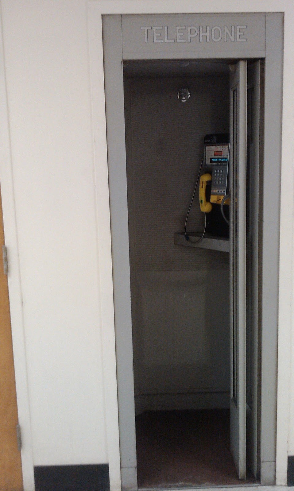
Built In phone booth


Almost directly across the corridor there's a men's restroom--but not just any men, because it was originally intended for faculty men:


Faculty Men only


This seems more suited to a high school campus, and is quite out of place here.  Although I doubt it was the case, it suggests there were also Boys' and Girls' rooms, and possibly also a Faculty Smoking Lounge.   I doubt if any attempt has been made to restrict the usage of this washroom for at least forty years, but the lock on the door does suggest it was restricted to keyholders at one time.


2011-03-30

Down, Down To Munchkinland We Go!

The Heart Of Screenland, according to the motto that goes with its official seal, is Culver City.  Considering that there are three major studios within a short distance of each other, along with one or two important landmarks boasting special connections to the history of film, that claim is justified.   

The Culver Studios administration building is featured in the title sequences of numerous films made under the banner of David Selznick.

Culver Studios
As near as I can tell, few if any motion pictures were produced under the Culver Studios label; instead the facilities were leased out to different producers and companies through the years. In the early years RKO and RKO-Pathe were here for many years.  This is where Gone With The Wind was produced, entirely on the back lot.  In 1956, Desilu Studios move in, and the facility became much more concerned with TV production.  The original series pilot episodes for Star Trek were produced here, although the series itself was produced a few miles away at Paramount.  Paramount, by the way, is across the street from the Alexander The Great Apartments, which we covered in an earlier post to this blog. Today Culver Studios operates as a full service production facility in a variety of specialties.  In addition to the expected emphasis on film, television, and commercial production, they also provide rehearsal space for top flight musicians and bands to perfect their sound before heading out on tour. 


The real center of downtown Culver City, however, is where Washington and Culver Boulevards intersect at a narrow angle and thereby form a sort of miniature Times Square.  Wedged into one of the resulting wedge-shaped corners is the Culver Hotel, the undisputed centerpiece of the district.

The Culver Hotel
The wider end of the building is where we find the main entrance.   Approaching the entrance, there's almost a European feel, which is not accidental.  The bare temperate zone trees in this picture, taken in early Spring, heightens this effect.

Culver Hotel Main Entrance


For a number of years before the late 1990s, this hotel was shuttered.  Despite the proximity of the studios, and a large residential district in easy walking distance, this commercial section was rather moribund.   Around the time new owners took over the building, Culver City's downtown was refurbished as a live theater took over the old Culver Cinema, and a coffeeshop and several restaurants came in. Much of Washington and Culver Boulevard was paved over to turn the entire area into a pedestrian zone; and the overall effort has proved to be fairly successful.  

The Culver Hotel is famous for having sheltered some of the cast and crew from the filming of The Wizard Of Oz--most notably,  Munchkins.  A remembrance of this event can be seen to the right of the entrance.


The Wizard Of Oz

with this informative card explaining everything to us.


Be careful to hold your breath so the poppies won't send you to sleep.


Turning around, we see the statuary group of the Harry Culver, for whom Culver City was named, and his wife and daughter.  It seems more like what we would expect to see on the main street of a small Kansas town--which is not surprising since the plaque tells us he was born there in 1880.  Harry Culver joined forces with Charlie Chaplin  to build the Culver Hotel, which opened in 1924 as the Hotel Hunt.


Harry Culver and Family

Not surprisingly, the hotel's prominence in the local film making scene goes back well before Wizard Of Oz.  In numerous, mostly silent, films of the 1920s the hotel appears as a backdrop.  Scenes from many of these movies are shown continuously on a large screen in the lobby bar.   

Let's take a look inside.  Because we're going in by the side door, we first pass through a private banquet room.


A hall for private banquets


Here's a view inside the Lobby Bar.   As you can see, they continue to show the movies regardless of the fact that the band is playing.


The band is cooking and Laurel and Hardy are, I don't know, probably making a mess in the kitchen.
Outside again, and continuing to our right, we come to some historical markers.


Historical Markers


Of special interest is the bottom plaque, placed by the Sons Of The Desert, the venerable Laurel and Hardy Fan Club.  The name of this club was inspired by their film of the same name.    As with the fictional fraternity, the fan club calls its local units "tents."  We can thank the association's Way Out West Tent for this tribute.

We pause to admire the building's tricked out cornice decoration...


 And the neo-Palladian accents and pilasters near the windows. 


The architects who designed this building, Claud Beelman and Alexander Curlett, also designed numerous other local buildings.  Many of these, like the Culver Hotel, boast the status of historical landmarks.

Continuing along the south side of the building we come to the hotel's narrow end. 


The Narrow End
If this whole area is like a like a miniature version of Times Square, then the Culver Hotel has to be a stand-in for Times Tower at the south end of the Square.  While this modest six-story structure is far less impressive than the New York tower shown in my link, it has fared better architecturally.  One Times Square still exists, but today is little more than a giant billboard. 


While the other, uptown end of the real Times Square doesn't seem to have an iconic building to match Times Tower, at the opposite end of this Culver City district is the Washington Building, home to  one of the better Starbucks locations. What makes this  Starbucks special is the interesting architecture of the building, which is obvious not only from  the outside,

Starbucks in The Washington Building


but is also clearly evident  in how the interior has been arranged to take advantage of  its odd, triangular shape.  Another attractive feature is the fact that much of the floor space is actually occupied by tables and chairs where the customers may sit while consuming coffee on the premises--as opposed to merchandise displays intended to facilitate the consumption of coffee at home.

The interior displays a patterned metal ceiling which seems to have been typical of early 20th Century commercial buildings, although it may be a recent emulation done in the course of restoring the structure.


Patterned metal ceiling

And we'll leave with a final exterior view.


Vergil Must Have Been Here

Acknowledging a penchant for Classical allusion, we need to mention the Roman Gardens Apartments, which have been very well documented by one of my favorite bloggers, the Dingbatologist.


The Roman Gardens

 This place is a few blocks away from my old high school.  What the Dingbatologist apparently didn't know was that, so many years ago, the trees in front were a lot smaller and more sparse, and that now they have obscured the awe-inspiring Latin translation of the name.


Romani Hortii
This was as much as I could get without looking like a would-be burglar; you can just make out the letters ROMA_I, or ROMANI.  Through painstaking field research, I was able to verify that the HORTII is also still there, concealed by the tree to the right.   It must be conceded that the abundantly fruiting  Citrus aurantium dulcis tree to the left, with its many aurantii, does give the place a fine Mediterranean flavor.  Or at least an orange-y one.

This building isn't far from the Quo Vadis Apartments, also covered by the Dingbatologist.  Since they are both near a high school I wonder if there was some Latin teacher there who owned these places in the early 1960s or some time around then.

The Venus de Mentone

We need not assume that the dingbat must be entirely devoid of classical stylistic elements.   Gracing an otherwise nondescript apartment building in Palms we can see the famous Venus of Clarington.  Or was it Mentone Avenue?


Nobody expects to find a semi-classical Venus gracing a Palms dingbat. 

2011-03-20

Stairway To Heaven: Even More Dingbat Paradise In Palms, California


As you reach the summit of Overland Avenue, northbound, you pass by this stairway on your right.  At first I thought it belonged to one of the apartment complexes that line this stretch of Overland.

Stairway To Paradise
But it isn't so.   Instead, this is evidently a public stairway presumably built and maintained by the city.  It leads up to the end of a short cul-de-sac seen, which looks like this.


Top of the steps


Walking onward and then turning right, we enter a short and steeply descending street of mid 20th-century dingbats.  These remind us strongly of the much more posh canyon neighborhoods of Brentwood, Beverly Hills PO, Beverly Hills itself, and the Hollywood Hills--specifically of the single-family houses typically built during the 1950s and 1960s in those areas.  However, except for one or two single-family houses, these are all dingbats.


This area is behind a hill to the southwest, sparing it some of the afternoon sun's heat.  Not surprisingly it appears appears a bit more lush than the surrounding streets.


And lastly a couple of views towards the way we came...


2011-02-02

Majestic in the westering sun they stand: The Hillside Dingbats Of Palms


For some reason, the much maligned dingbat style of apartment house weaves its sinuous way in and out of this blog.   Possibly it's because I not only live in one, but also  it happens to be in the Palms district of Los Angeles--otherwise known as the absolute nexus and center of all things dingbat.  Here's an overhead view, the overall look and feel of which will be familiar to anyone who's been a passenger on a plane heading into LAX.


Seen from this perspective, you'd think you could borrow a cup of sugar from someone in the next building over without either of you leaving your apartment.   

Dingbats perennially get a bad rap for the artificiality of their style, for they tend to be festooned with architecturally meaningless appurtenances.  Either that, or because they have no style at all, which just goes to show that sometimes you can't win.  They also garner a lot of criticism for the prominence of their ground floor parking spaces, which is said to promote car culture and a car-dependent lifestyle.  This is unfair, because like multifamily housing generally, dingbats are usually closer to shops, cafes, and cultural amenities then single-family houses.  Almost always,  moreover, dingbat neighborhoods are better served by public transit.  These humble abodes offer the choice of a car-avoidant lifestyle.  If you've ever lived in an apartment that came with fewer parking spaces than you have cars, and you've experienced the bi-weekly street-cleaning parking space juggle, you might well conclude that apartment life strongly discourages excessive car-dependence.


In an earlier post we saw a series of series of dingbats whose owners or builders seemed to have been inspired by Classical culture.  In this post we'll look at some dingbats that exhibit some interesting mid-century architectural details, and are also notable for their siting.


March of Dingbats

What I like about this shot is it shows that, even in L.A. you don't have to belong to the uppermost economic strata to afford a hillside home.  What's more, these apartments belie the usual pattern of dingbat siting, according to which each apartment house is sited among scores of other, similar buildings on land that is absolutely flat. Instead, the occupants of these apartments have commanding views of the plains below.  Without a doubt,  said view isn't much to look at during the day, but from sunset to sunrise it's a different story. 


Of course, some balconies on this one would have certainly been nice.  Now let's take a closer look at the imposing brutalist facade.


Nobody can fail to be impressed, nay, intimidated, by the imposing brutality of its brutal presence.  You know those zombie movies where the entire planet has become infected and overrun, all except for one fortress-like compound where the scientists race to find a cure?  This could be one of those fortresses; not least because this particular dingbat occupies such a commanding strategic position at the top of the hill.  Of course from the previous picture we know that the illusion of an impregnable fastness is granted only to those who look at it head on.   


Coming to the upper end, we see the builders were sufficiently moved to continue the illusion around to the uphill side...


...for maybe 15 feet.  Be that as it may, however, I know where I'd rather be when the zombies arrive.


Let's look at the building next door, which is distinguished by the "slats", as I believe the technical term is for those vertical planks in the facade.


According to public records, this one was built in 1955.  You cannot hope to understand the driving aesthetic of 1950s domestic architecture unless you appreciate the central importance of slat-work, both indoors and out.  If you reached the age of awareness any time between 1953 and 1963, you must have noticed this.   Evidently the urge to divide spaces with walls-that-were-not-walls came into full flower during this period.   It continued for some time after that as well; you need only watch some vintage TV episodes--examples abound in Star Trek:TOS--to convince yourself of this.


Zooming out a bit reveals one good quality that this stretch of dingbats offers.   Rather than slicing off a flat parcel on which to build a typical apartment house, the builders of these preferred to shape their dingbats to conform to the terrain.  


The foreshortening makes this dramatically evident in the building on the right--which is none other than the Tactical Zombie Abatement Command Center that we examined previously.  While this terrain-hugging layout of the building is undoubtedly pleasing to look at, it must be said that it has its practical disadvantages.   Anyone who has ever moved from one unit to another in a building like this knows this: every change of level means another two or three stairs that have to be navigated with every stick of furniture, not to mention every cart or dolly-load of smaller items.  


Our last building is another good example.


 At first, the facade here looks like it's covered by small tiles of slightly different shades of off-white.  As a matter of fact it was this illusion that first drew my attention to this group of buildings.   As I continued to look at it, I was disheartened to notice it looked like that external disease that runs rampant in the dingbat world: stucco treatments.   Fortunately that's not the case, here, however: instead, the building appears to have been faced with a layer of small field stones.  As originally used it's highly likely  that the rocks were left in their natural color, which was undoubtedly some shade of brown.  With that in mind, the fact that they have been painted over seems to be an improvement.


( Note: There did use to be some additional content here.  That has been moved to its own post, which starts right about here.)